Duration: 3 weeks
Tools: Adobe XD & Illustrator
Role: UI Design
Deliverables: Responsive design, Logo redesign & Accessibility test
Project Overview
Active Wales is a community group for retired pensioners based in Wales which aims to eliminate loneliness and isolation amongst older adults. To achieve this, Active Wales promotes social inclusion through community actives, various social events, and campaigning or raising awareness for issues around older adults.
The challenge-
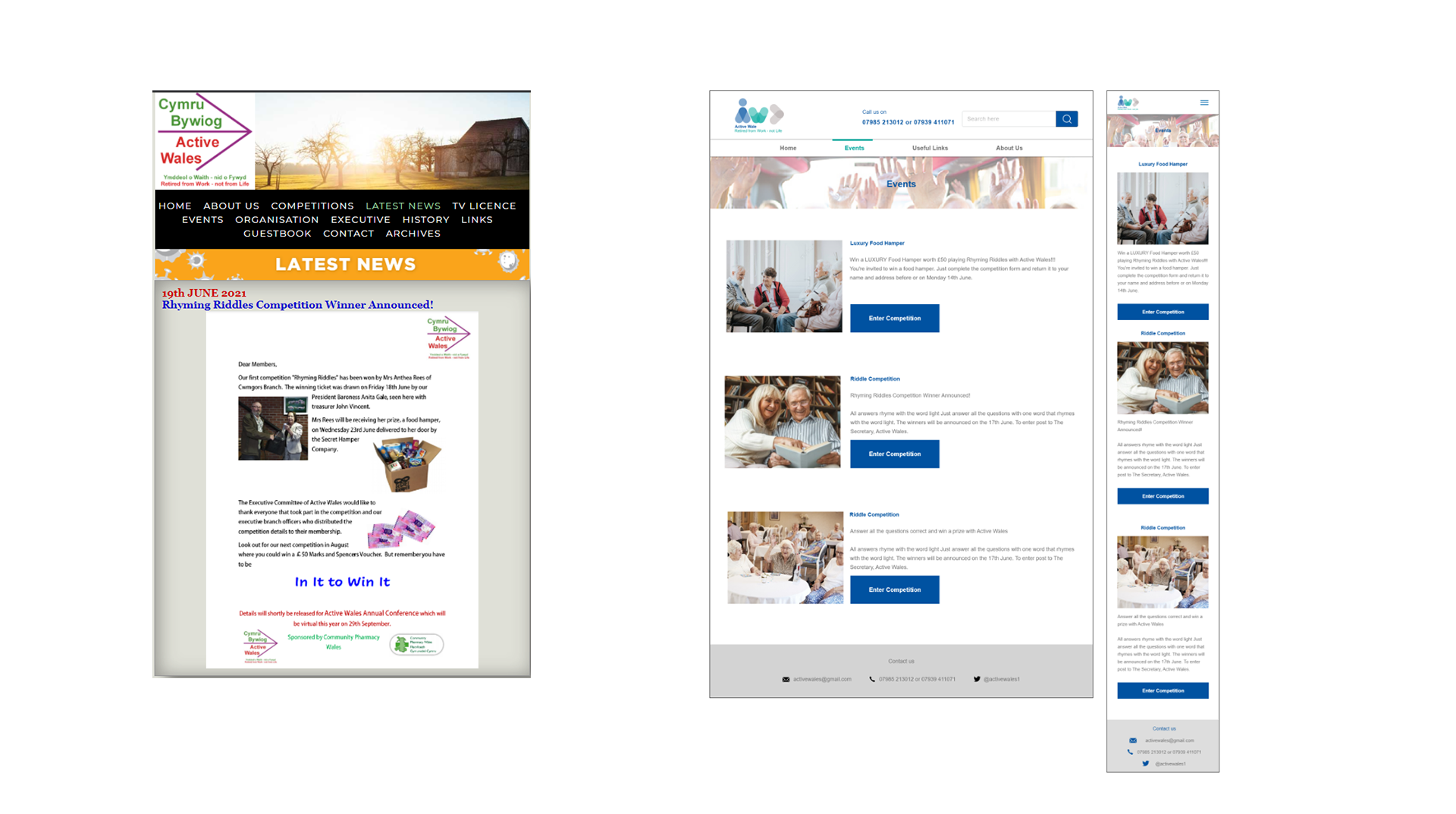
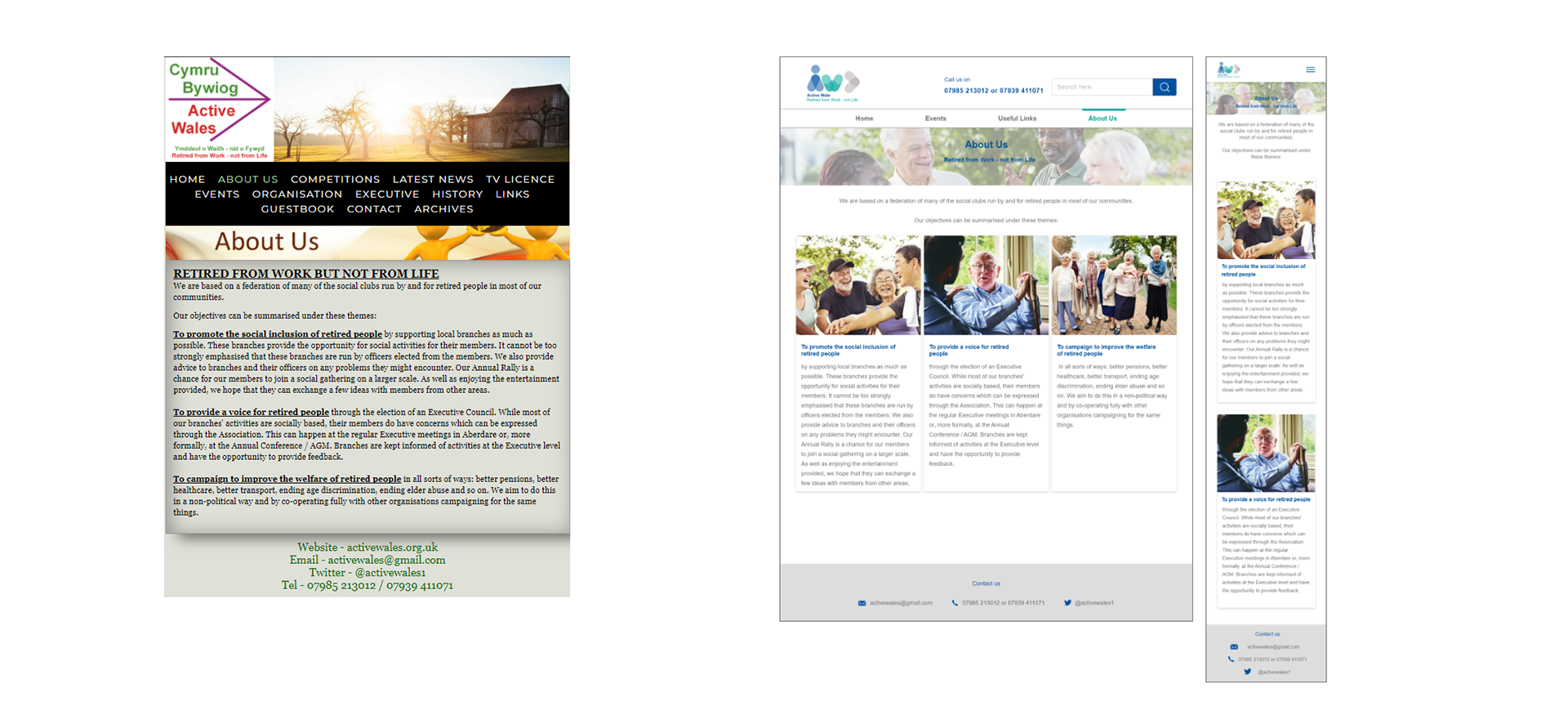
The current website does not communicate clearly who Active Wales is. Aesthetically it is a visual dumping ground that doesn’t do justice to the charity’s purpose. There is no structure to the content which amplified confusion rather than coherency.
The Current Website:
User flow diagram:
To start, I went through the website and made a list of the key screens/ information needed. Then I created a simplified flow diagram.

Mid fidelity
Since the flow was quite straightforward, I moved straight onto digitalising the flow in mid-fidelity.

Style Guide
Currently, the brand does not have a consistent identity. As the target audience is very specific, I took my time to craft the style guide so that it was tailored to meet the needs of the user.
Colour Pallete

Typeface & Icons
I decided to use Arial as used as it’s easier to recognise the characters for those with visual impairment. UX researcher, Caroline Jarret found that typefaces without serifs are universally preferred amongst older adults.
I used icons as they're easy to understand and does not offend the user.

Logo Redesign
The current logo is quite dull and the red text is difficult to read against the white. I wanted the logo to be simple, meaningful, and pleasing to look at. I used flat shapes and humanised the ‘A’ to reflect the ideas of community and soft shades of blue and green to create a warm and welcoming feel.

Accessibility Checker
As some of the users may have visual or other physical impairments, I made sure to check that the colours and text are accessible for all users. To do this I used accessible-colors.com.

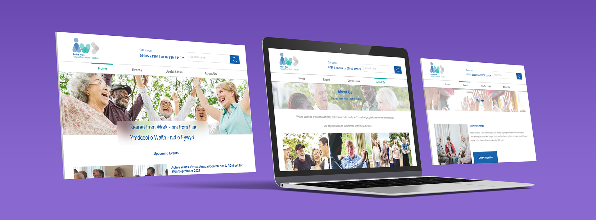
High Fidelity Breakpoints
To increase accessibility, I created the website responsive. This is because, as society moves away from traditional landline phone connections, mobile phone technology has become more important for older adults. Here’s the website before and after in high fidelity.
Home screen
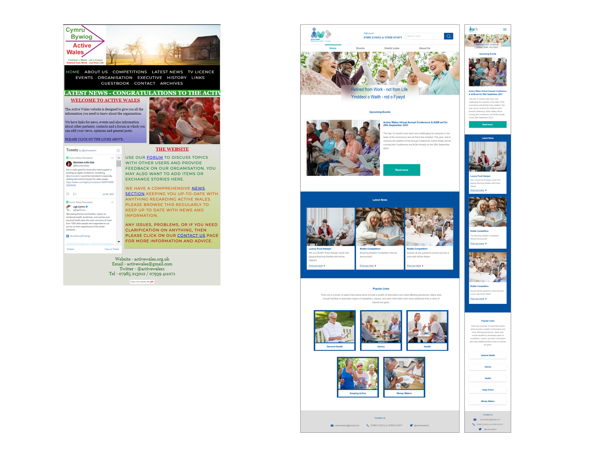
Events
About Us
Our Executives

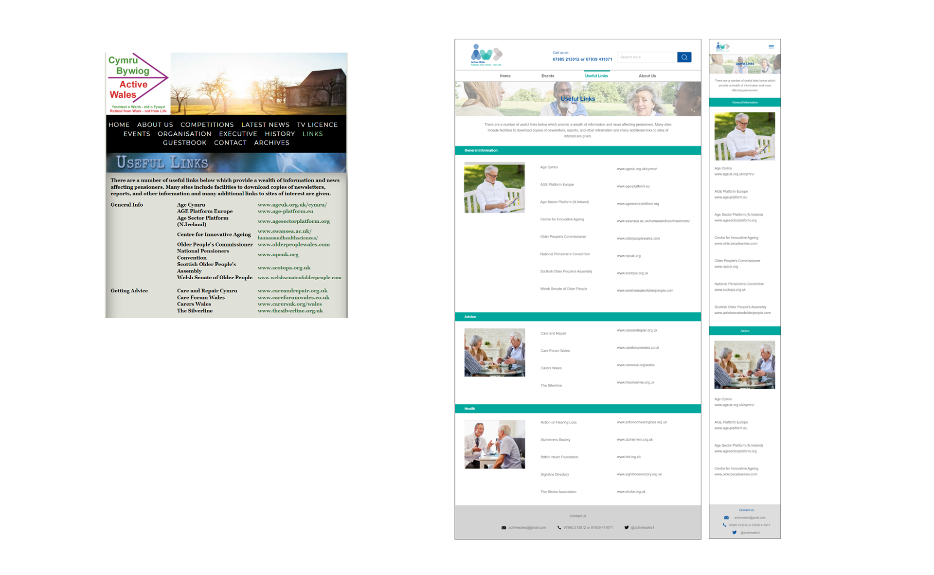
Useful Links
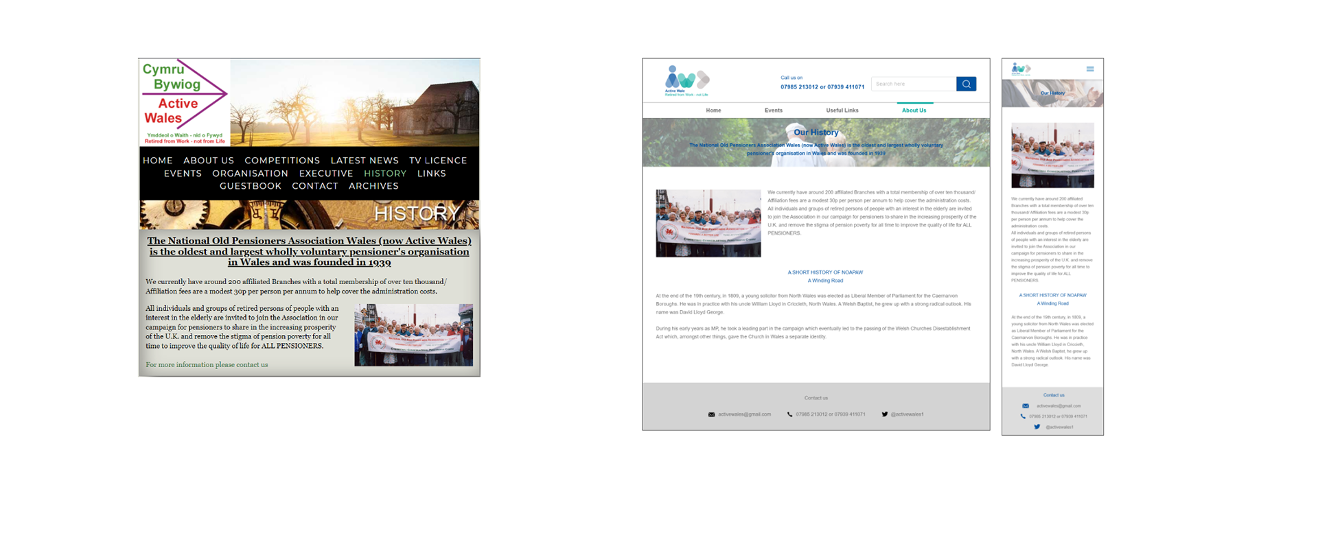
Our History
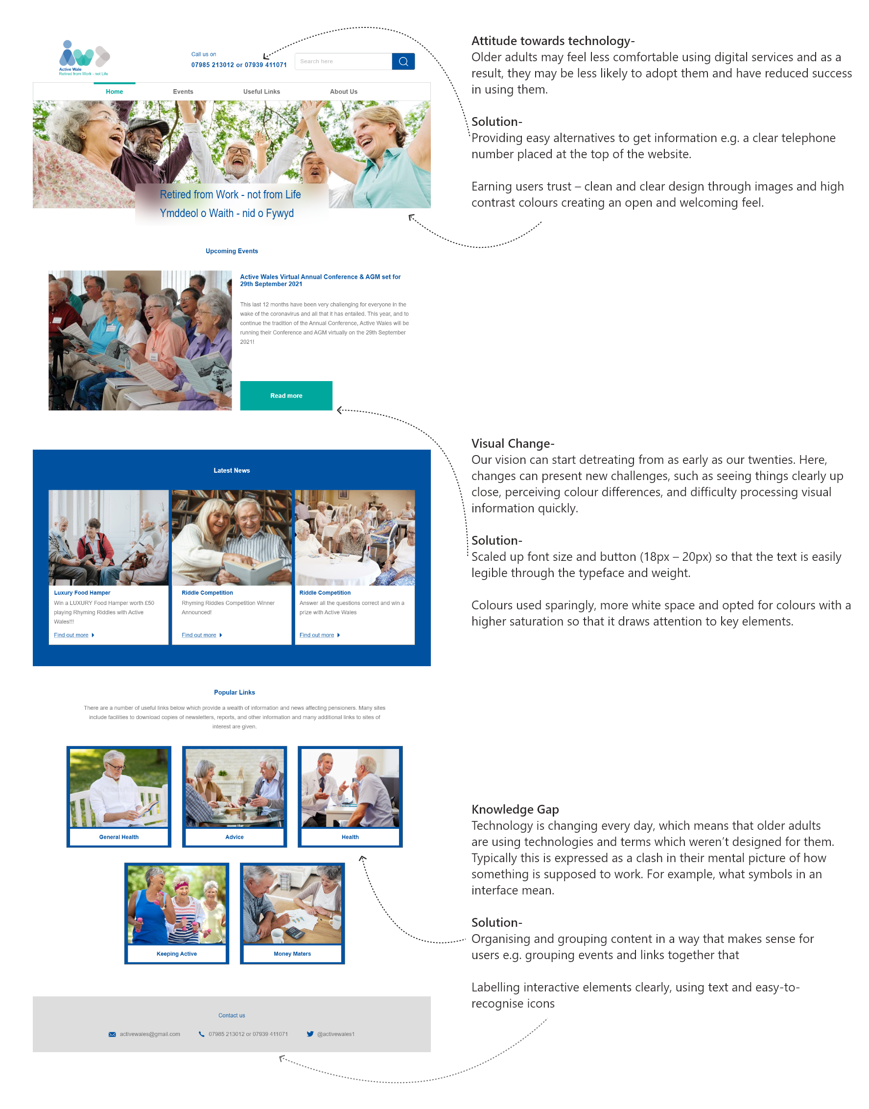
Considerations When Designing For An Older Audience
Reflection
For this project, I honed in on the accessibility, visuals and colours so that it creates a more meaningful and enjoyable experience for users. I particularly enjoyed redesigning the logo as it has been something I have been meaning to try as a designer and I’m glad that I took up the challenge.
As the number of older adults increases, I understand that it becomes more important to design websites and other digital services inclusively so that it meets their needs. By designing for an older audience has deepened my appreciation for technology and how it has become increasingly important to stay engaged and connected in today’s world regardless of age.
Thanks for scrolling!