Project Overview
Sector: Healthcare | Duration: 13 months | Tools: Figma | Role: Product Designer
Who are Vhi?
Vhi Healthcare is Ireland's leading health insurance provider. They offer a wide range of health insurance plans and services, including hospital cover, outpatient benefits, and wellness programs.
The problem
The dashboard carousel cards had been an issue that had appeared several times in past user testing projects. As a part of the design team for App, we proposed a new project of upgrading the current dashboard screen to see if it can work harder and maximise the space.
We wanted to look at how we could evolve the current design and potentially change the format to suit the evolving needs of the business. Below is an example of how the dashboard screen looked prior the upgrade:

Project Deliverables
- New component and update existing components within the design system.
- Component documentation.
- Illustrations and icons.
- Designs for iOS light, dark and Android Light and Dark.
- Prototype for user testing.
- Designs for various users and scenarios
Goals
To create awareness of Vhi products and potentially increase sales by using the carousel cards as a sales tool.
To create awareness of Vhi services and campaigns e.g. Mental Health services during mental health awareness month, Vhi’s mini marathon etc.
Increase repeat use of the app.
Phase 1
Competitors Analysis
An initial research phase was conducted to see how the current landscape across several sectors design for similar purposes. For this, 5 apps were analysed based on their effectiveness of different dashboard carousel card designs and how the space is otherwise utilised.
The analysis will include information gathered about how users will potentially interact with the product and how effective they are at creating awareness of products, and how they “sell” products, the information being displayed, and cross checking for any similarities in design or user experiences.
Background:
The carousel cards requires a review to see how the space can be better optimised. We are aiming to look at how these cards can evolve to suit the needs of changing business requirements.
Main Objectives:
1. To use existing space more productively.
2. Updating the cards regularly to encourage attraction and for users to come back to see what’s there.
3. Dealing with similar cards such as if someone has several upcoming appointments

Meerkat
The Meerkat app allows users to compare services/ insurances that the market has to offer. Members are able to collect rewards and collect points on things like Cinema and dinner.
Format:
Top carousel has 3 cards to scroll through
Carousel cards are as a notification/ sales card for reward members
Next section is followed by Rewards and then popular insurance search
UX Analysis:
horizontal scrolling looks visually pleasing and good use of brand colours.
Takes up too much space, pushes content down the page
Information further down the page may be more useful for users e.g. Products.
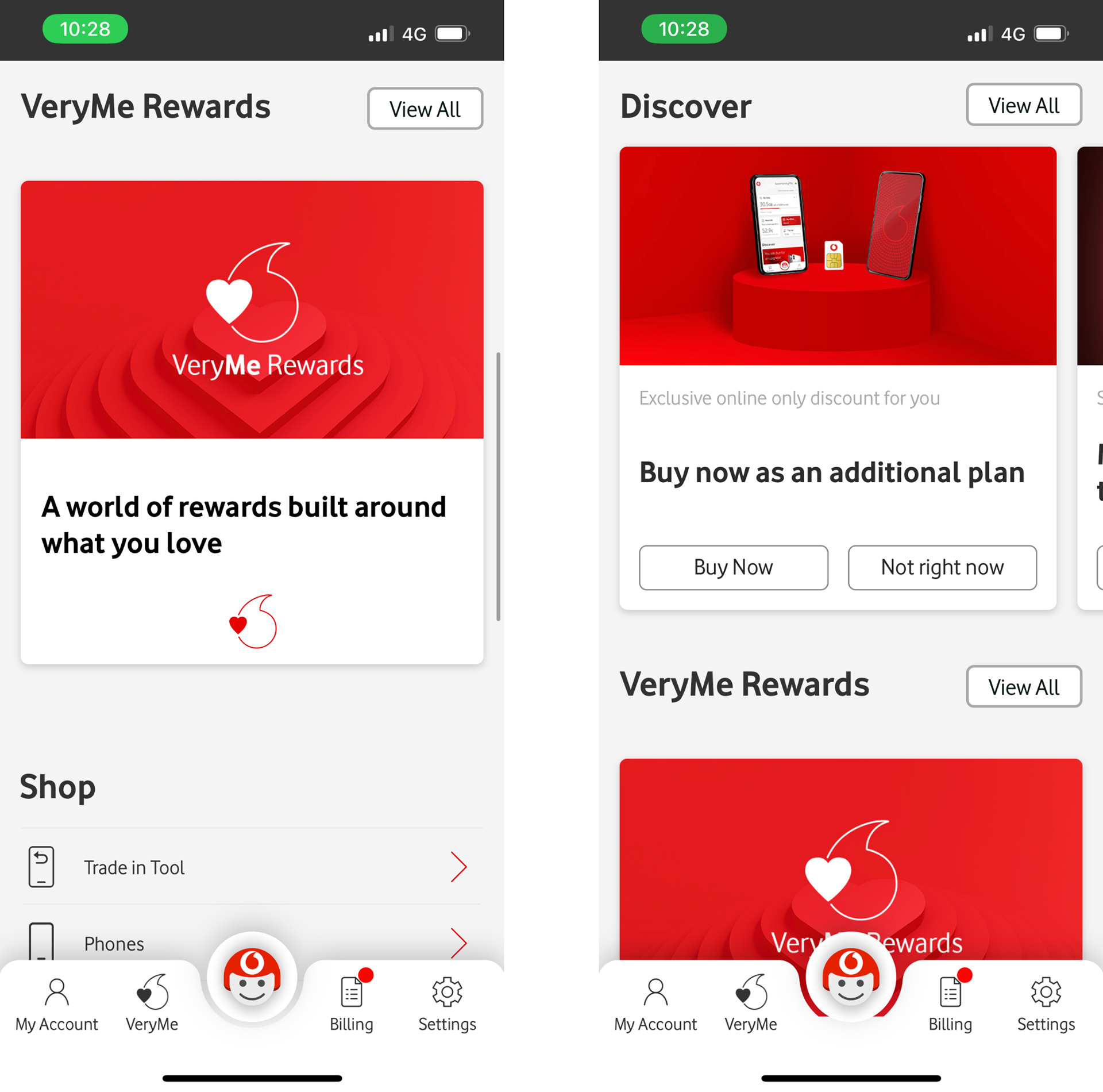
Vodafone
The Vodafone app allows users to manage their mobile, fixed-line services, broadband, and digital TV services.
Format:
Top 3 carousel cards are used as promotional content and rewards to collect.
All cards are displayed as carousels.
Two CTA’s, first being an action button and the second to close the card.
UX Analysis:
Likely to be scrolled past as they only highlight promotional content one at a time.
Overuse of horizontal scroll, this works well if it’s used sparingly.
Only one card be viewed at a time, reduces the amount of content that can be viewed on the screen.
Enables users control to remove cards.

Vitality
Health and life insurance provider.
Format:
Top card scrollable carousel with 3 cards with CTA/ Used as a notification card.
Card has an image at the very top followed by header, copy and a CTA button.
UX Analysis:
Icon takes up too much space and doesn’t actually add much value
Colours must be checked for accessibility e.g. green card and white text
Clear CTA’s and the 3 dots is a good way to indicate that the content has a horizontal scroll.
Patterns and trends
Carousel cards are featured at the very top of the homepage.
3 cards are the minimum amount of cards that are used.
All carousel cards are informative and have clear CTA’s e.g. pill/header and body copy/CTA button (or something similar).
All cards are stacked with an image at the top and content then CTA.
Cards are used as a shortcut to take users to popular searches or promotional content.
All carousel cards use the brands colours.
Some use the feature of closable notifications/ cards to push content up the page.
Our recommendations
To truly take advantage of the screen estate, we would suggest redesigning the dashboard as a whole and rework the carousel feature as a promotional section.
Reduce the size of the carousel so that more content can be shown on the screen.
Add another section under the carousel cards for popular search e.g. online doctor.
Make CTA more prominent, reduce the size of the image.
Phase 2
The Designs
Using what has been gathered, the competitive analysis was used to inform the design phase. This phase took into account all types of carousel cards that the user may be able to view, for example, appointment cards.
Also, I had to be mindful of what is feasible in terms of development and work with what is already existing within the Design System.
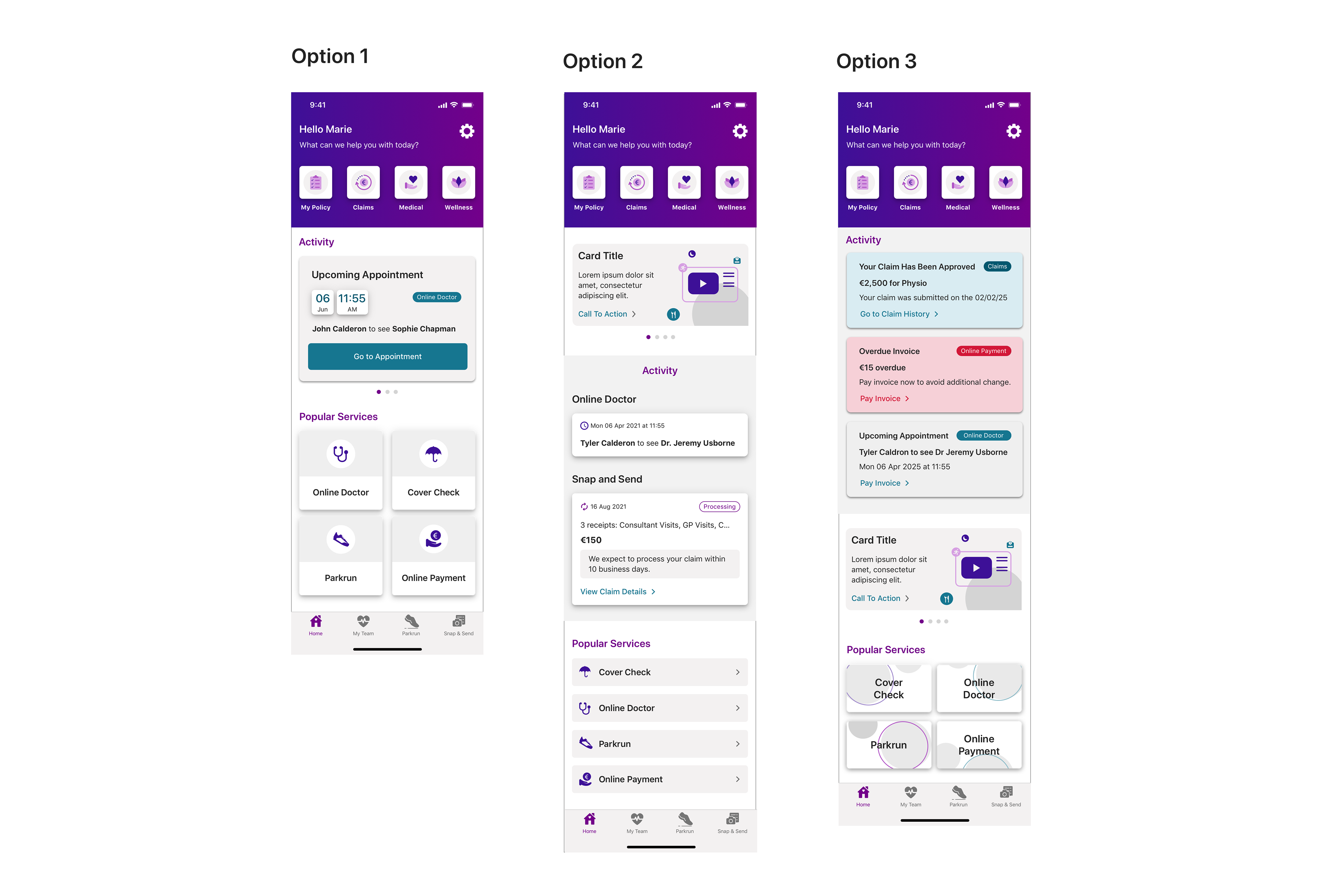
For each phase of the design process, three options were crafted and presented in a comprehensive deck. Below are the three options that were showcased:
Design Challenge
Time restraints:
Vhi had wanted to get these designs live by the of their billable year. This meant quick turn around and developers building components and designs that were still being tested.
Vhi had wanted to get these designs live by the of their billable year. This meant quick turn around and developers building components and designs that were still being tested.
Despite the tight turnaround, this allowed us to build stronger rapport with the development team—a goal that we have been working towards for the last 8 months. Now as a part of our process, we have monthly check in with one of the members of the development team to go through any queries.
Edge cases:
Before kicking off the design phase, we asked for the various scenarios to be provided. While I was working on this project, there was other value-stream work being worked on, one of which would have impacted the layout of the cards. I was able to rework the current scarios to accommodate the potential growth of new features being added to the app.
Before kicking off the design phase, we asked for the various scenarios to be provided. While I was working on this project, there was other value-stream work being worked on, one of which would have impacted the layout of the cards. I was able to rework the current scarios to accommodate the potential growth of new features being added to the app.
Figma migration:
Until March 2024, Vhi used InVision and Sketch for design. After InVision announced its closure, our team led the migration to Figma during the ongoing Dashboard project. This made the Dashboard and its components the first to be migrated, though it did cause an unavoidable delay, it gave us time to take a step back from the designs and see if there was a better way to design certain sections.
Second iteration of designs
The business had informed us that they like the three sections that were proposed:
1. Activity section
2. Corporate section
3. Useful Services section
Based on the data gathered from the pervious iteration, I looked at refining the following areas:
1. Creating rules on how each section should function and the type of content that will appear here.
2. Utilising the new branding colour palette and illustrations.
3. How to reduce cognitive load by reducing scroll, this is especially for Android users.
4. Creating a new section where the app can sell certain services.
Here are the three designs options that I proposed to the business:
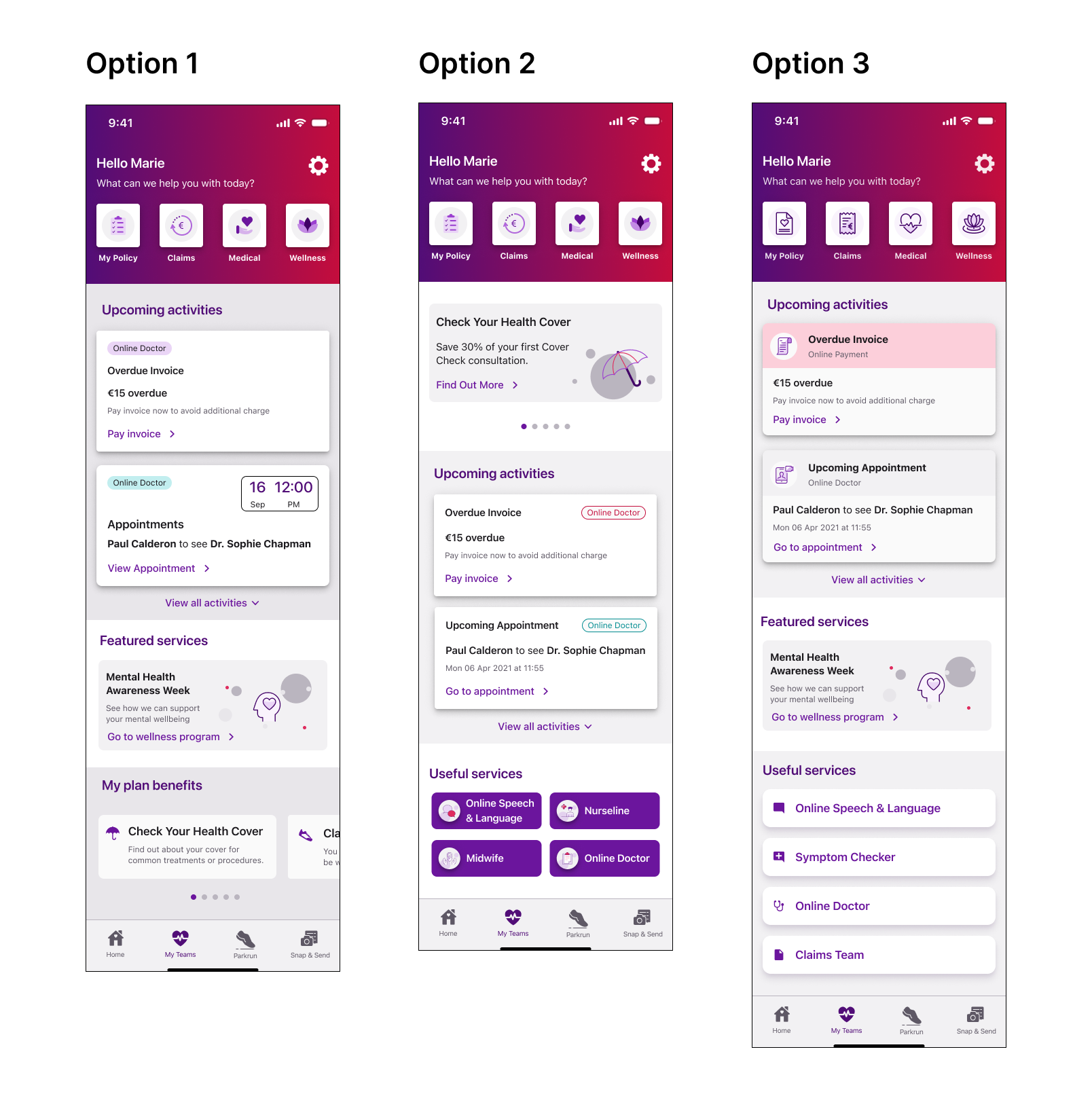
Design Thinking
The business pulled out key elements from the previous designs that were working well. Based on that feedback, I refined each option to optimise the usability.
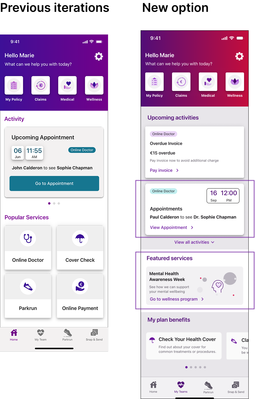
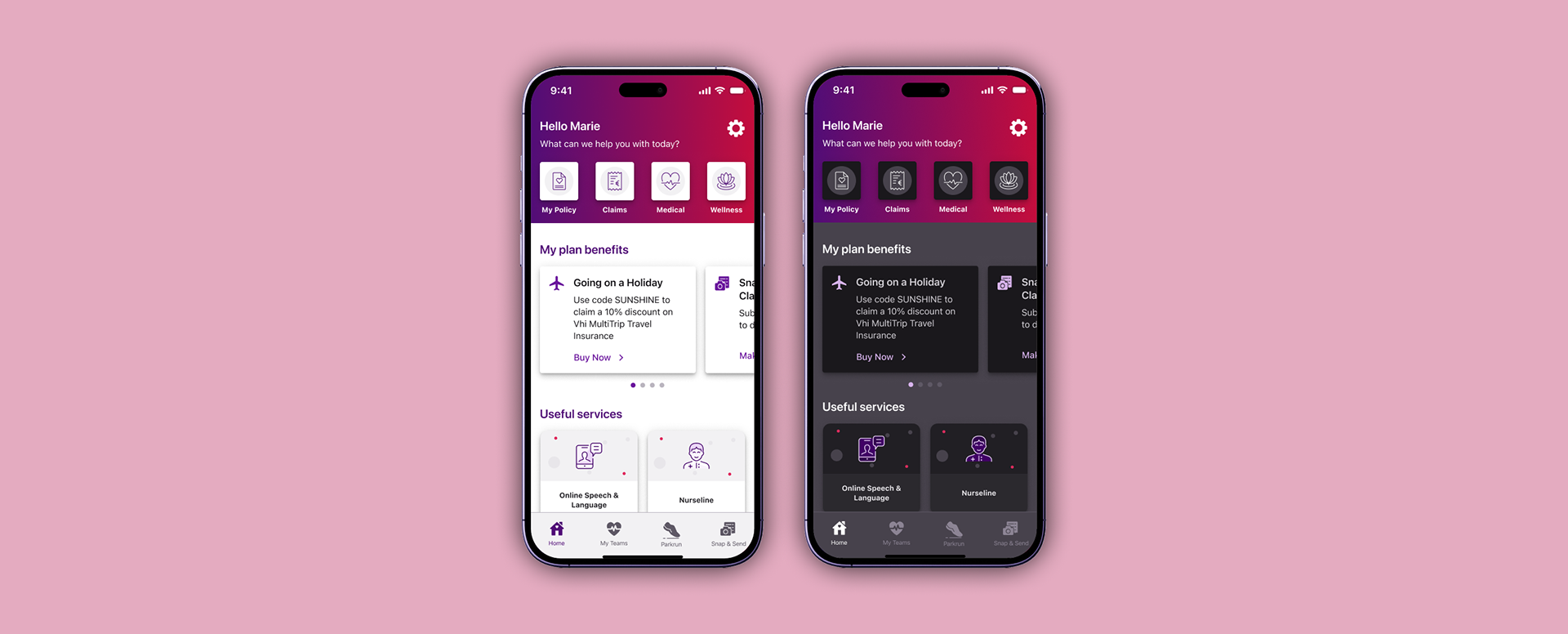
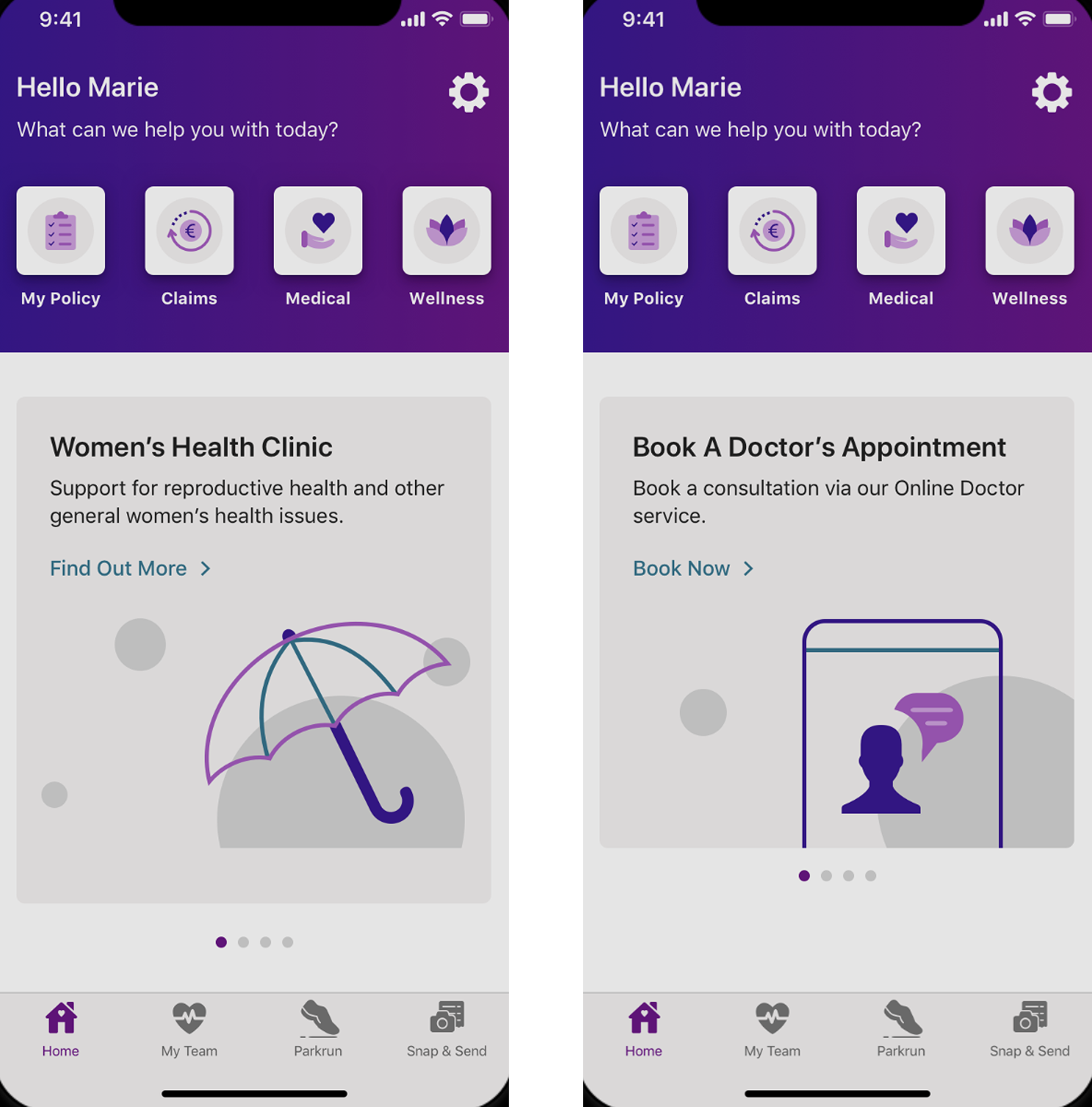
Upcoming appointments card:
The stakeholders really liked the way that the ‘Upcoming appointments’ were presented and wanted to keep the time and date prominence.
The previous iteration had too many busy sections on one card e.g. elevations used for the date and time and using the primary CTA button. I slightly stripped back the design by removing the elevation and changing the CTA to a tertiary state.
Introducing a new ‘Featured services’ section:
A section dedicated to promote specific services available for a short time e.g. Mental health awareness week.
Use of new illustrations:
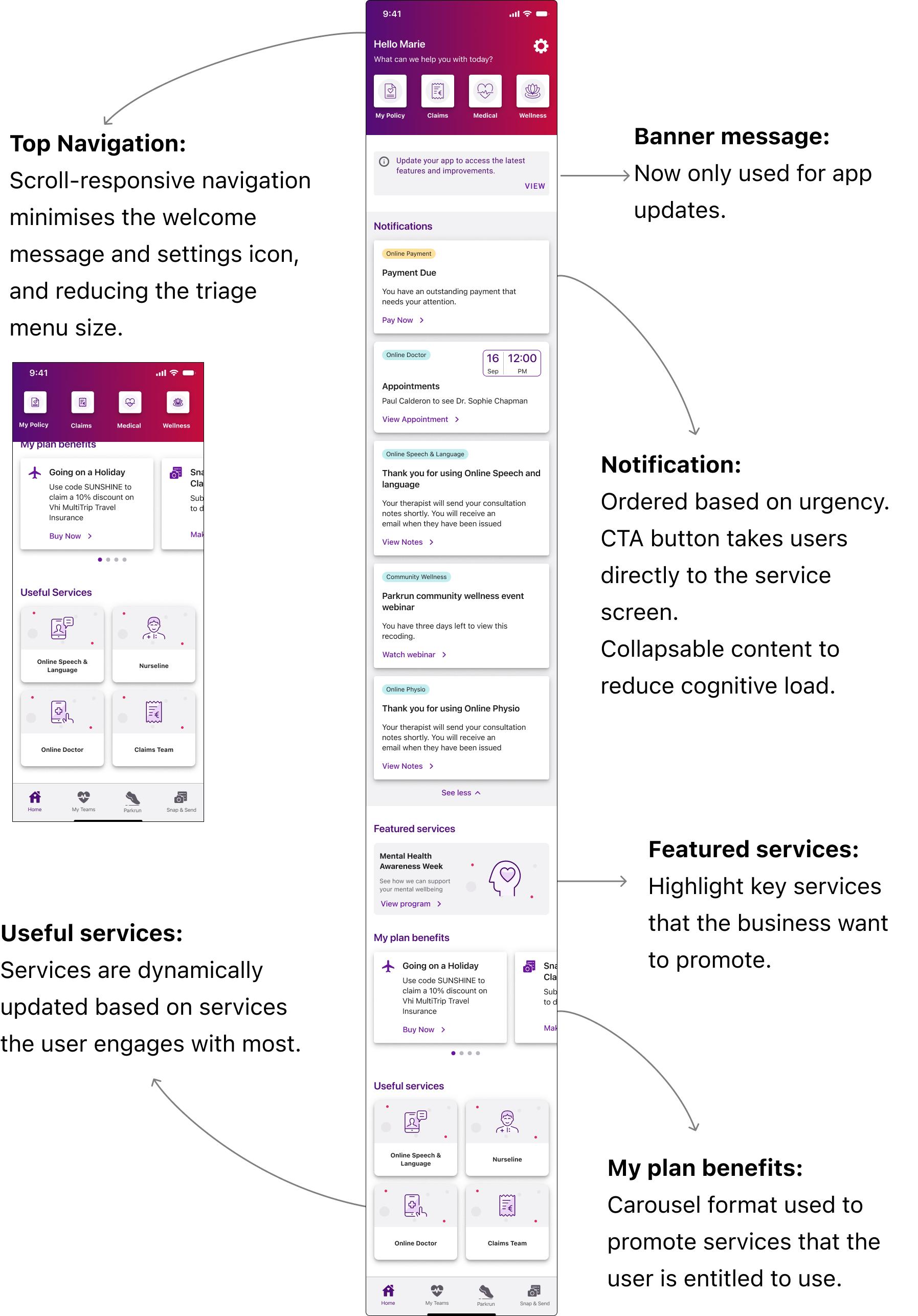
Since the app uses the Material icon set, we couldn't update all icons. However, the dashboard redesign was an opportunity to showcase the new illustrations and icon style.
Since the app uses the Material icon set, we couldn't update all icons. However, the dashboard redesign was an opportunity to showcase the new illustrations and icon style.
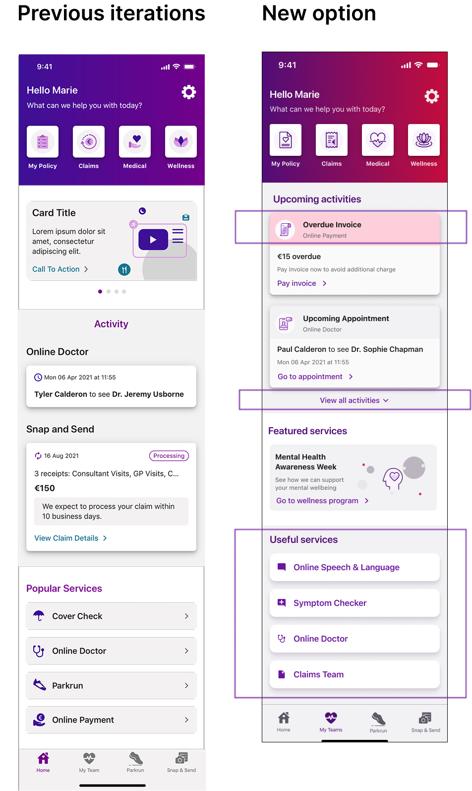
Card rules:
For this version, I created some rules on how many cards should be shown on each section. Upcoming activities should have a max of two cards displayed on collapse. If there is only one activity then the expandable CTA will not be visible.
For the Useful services, this is a section that will feature services that you are entitled to and based on your needs will be displayed here. This will only be displayed for users who have a premium package.
Vhi have been looking at ways to sell more premium packages and I proposed that this could be a way to do that.

Optimising space:
One of areas of improvement that I looked at was how to optimise the space and reduce scrolling. On scroll, I created a version where the top navigation collapsed to a minimised state where only the triage entry points are shown.
One of areas of improvement that I looked at was how to optimise the space and reduce scrolling. On scroll, I created a version where the top navigation collapsed to a minimised state where only the triage entry points are shown.
UI changes:
With the introduction of the new colour palette, the stakeholders wanted to see more of the new branding being utilised, particularly the purple colour. I used this for the Useful services section.
Promotional section:
As Vhi want to sell more of their services, I created some rules on the how the carousel feature.
Final Designs & Deliverables
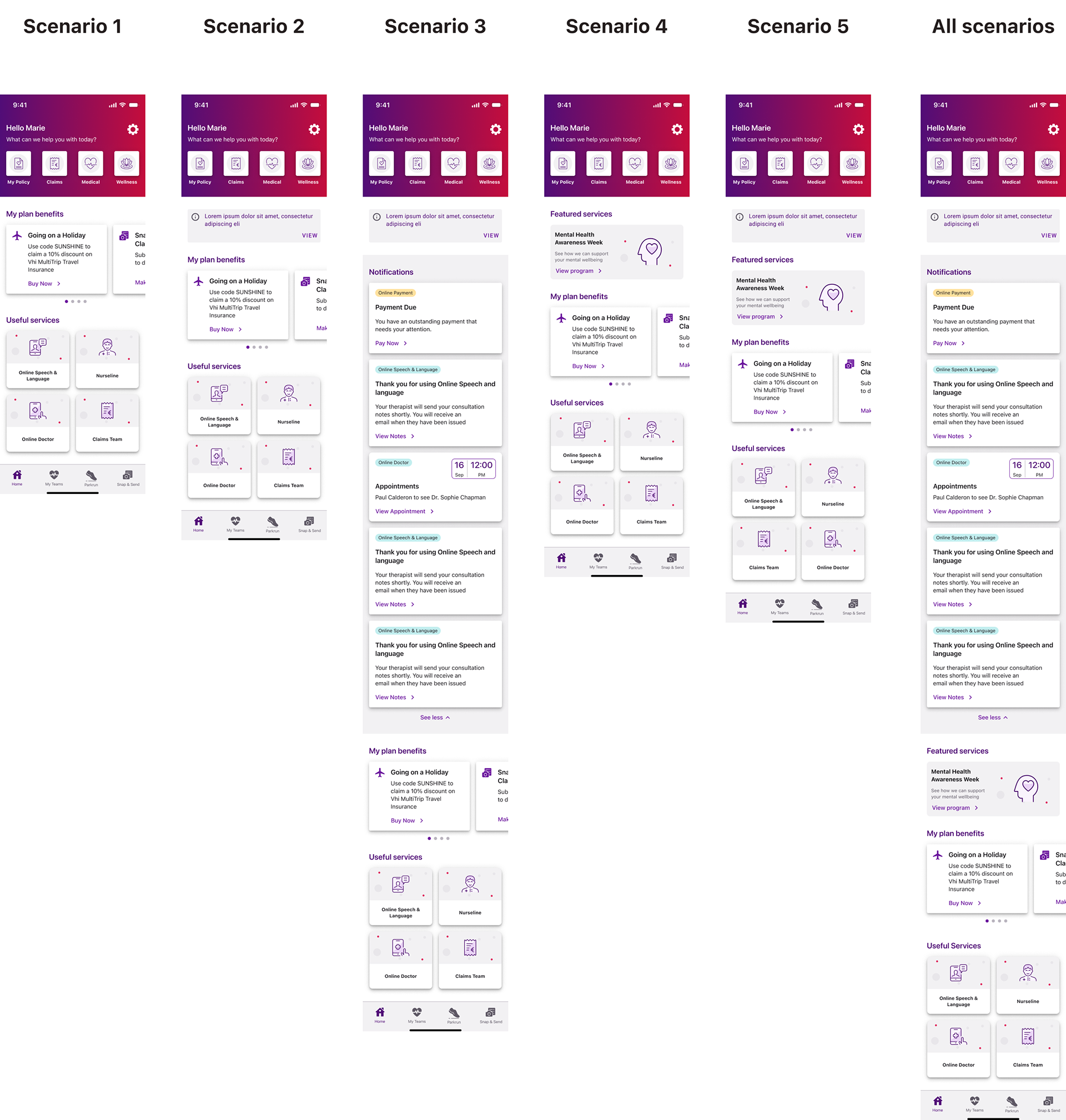
As part of the project deliverables, I mapped out the potential user scenarios, I've listed these scenarios below. Scenario 1 was launched as the MVP, with the Research team planning to conduct usability testing on it as the next phase of work.

As part of the deliverables for this project, once the iOS designs were approved, the next steps included creating the dark mode and Android designs. As well as this, I created a documentation file that outlines the spacing guidelines and the rules around the component to ensure consistency across platforms.
Retrospect
The MVP design of the dashboard went live on the app on November 6, 2024. Prior to the launch, we conducted a small-scale unmoderated user test to assess user reactions to the new pathways introduced. The feedback was overwhelmingly positive, with the new layout being well-received.
The business shared great feedback on the new dashboard layout, noting that it was well received by both internal stakeholders and app users. This was further reflected in a measurable improvement in the app’s rating, which increased from 4.4 to 4.6 stars since December 2024.
Another key outcome was the successful introduction of bi-weekly dev call check-ins. As an external agency, our involvement typically ends at the design phase, but during this project, the business began to recognise the value of closer collaboration between the design and dev team. This shift has laid the groundwork for stronger cross-functional alignment moving forward