Sector: Charity
Duration: 1 month
Tools: Adobe XD
Role: UI Design
Deliverable: Mobile app
Context
SAL is a charitable organisation that aims to eradicate extreme poverty for people living in Sub-Saharan African. Most charities often target the symptoms of deprivation and are unable to make the impact required to deliver economic at ‘ground zero of poverty’.
SAL’s objective is to make sure that fundraising activities are transparent for its donors. Users are able to select a specific cause to support, track the progress, and see real-time live updates of the
Project Overview
For this particular project, I worked closely with the client as well as collaborating with the graphic design team and developers. The Sal mascot and the user flow of the app had already been pre-established. My role was to bring all these elements together in the mobile app.
The Challenge
Apart of the brand's identity, there are preestablished elements that the client wanted to incorporate into the mobile app, such as hand-drawn illustrations, videos, and the logo. All these elements had a fun, bright, and human feel to them. The challenge here was to find a way to balance out these elements and evoke trust with our donors.
User Flow Diagram
Before joining the team, a basic user flow had already been made. I used this as a template to flesh out the rest of the flow.

Style Guide
Colours:
Creating an emotional appeal with donors is an important aspect, and capturing the right balance of colour can tap into a donors' feelings of generosity and compassion. To create a sense of trust, I opted for opposing colours as it evokes a sense of harmony.
I used cool tones like blue as it is considered to be a colour of stability, loyalty, and trust. Blue can also evoke a sense of melancholy and sadness, To balance this out, I used warm orange tones. Although orange is eye-catching, I used this sparingly throughout the app as it may evoke a negative emotional response from donors.

Typography
Montserrat
Rounded corners and curves add a modern touch as well as creating a sense of trust.

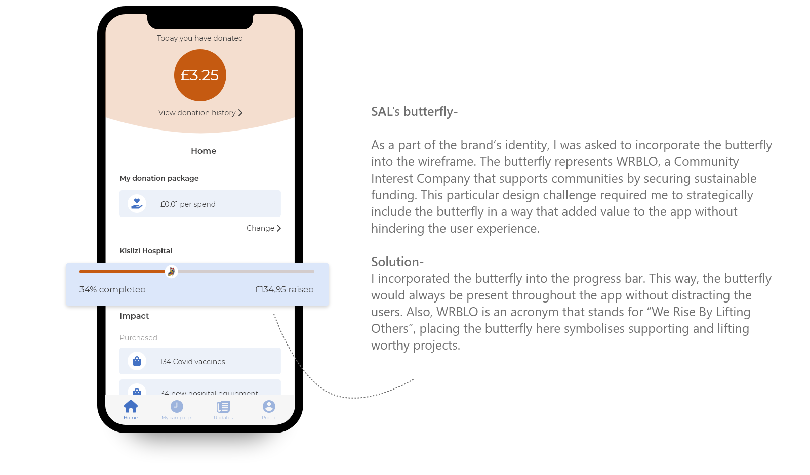
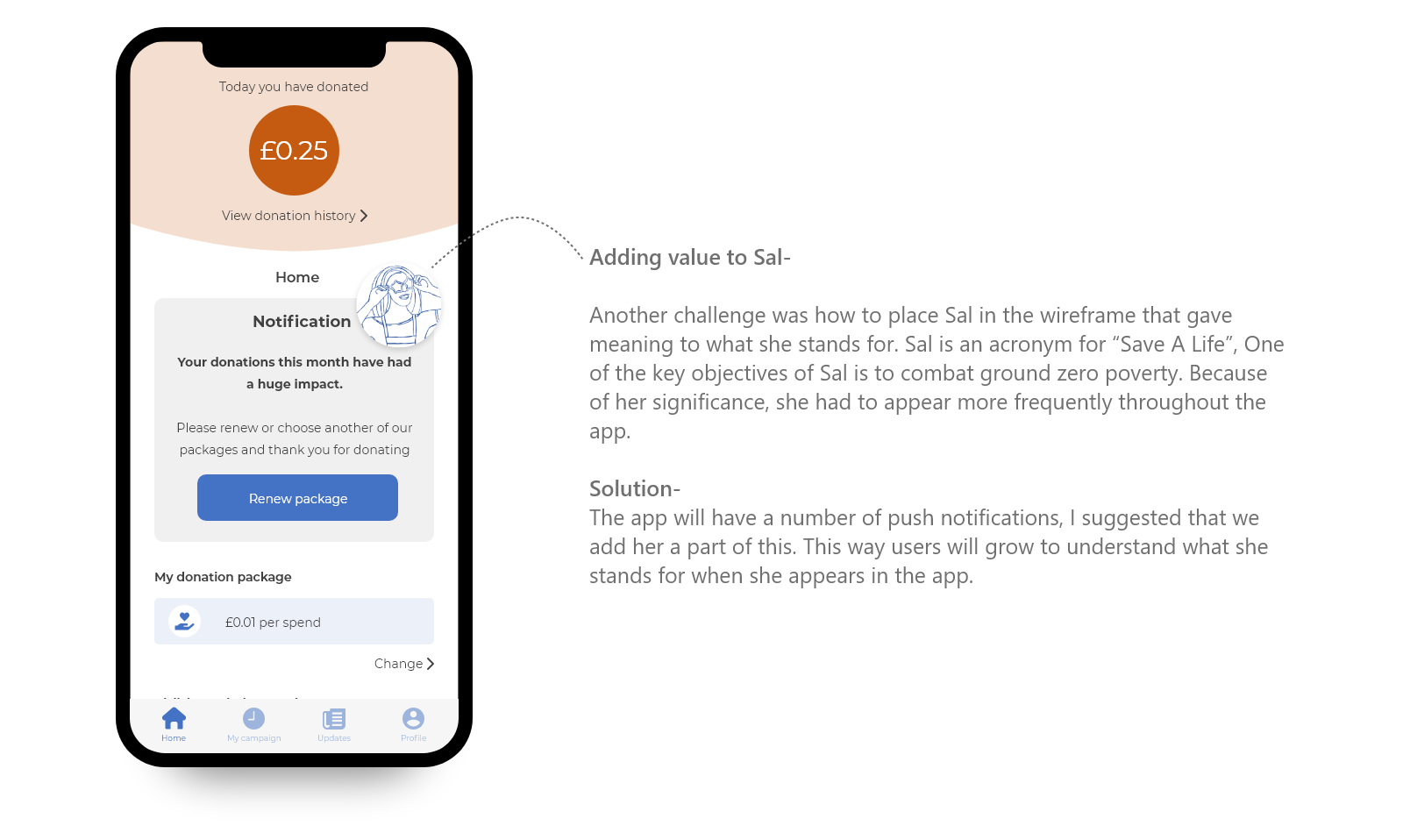
Handdrawn Illustrations
Hand-drawn colourless illustrations creates a bridge between the digital world and the real world. This creates a psychological appeal by suggesting that the illustrations on screen have been drawn by a real person and in turn, making the campaigns on the screen feel more “real” and personable.

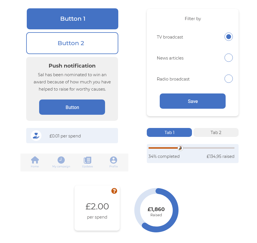
UI Elements
Orange used sparing throughout the app and used to draw attention to certain points of the app.
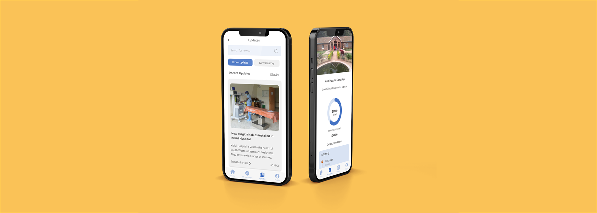
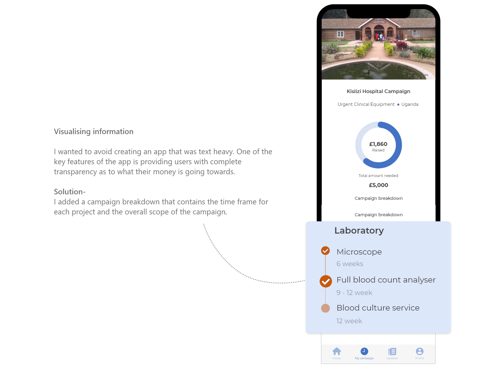
High Fidelity Wireframe

Design Solutions
Demo Video
Retrospective
Working on projects that are is something that has always been important to me and this project has been just that. I was able to collaborate with other creative-minded people to come up with design solutions fairly quickly which was a really enjoyable experience. Although the project was probably the shortest, I learnt a lot in a short space of time such as:
Prepare for designer’s block:
At one point during this project, I hit a wall where I was unable to come up with a design solution. Luckily, I was prepared and planned how to get back on track, now looking back, I find that I am able to conquer the block quicker than the time before.
The power of collaborating
Up until now, I have been working on solo projects, if I did need some guidance then I would usually seek help elsewhere. Working in a highly collaborative environment was great as it increased creativity and I was able to learn a lot from my fellow teammates.
Thanks for Scrolling!