
About Project
TiiQu is a blockchain-based verification app that allows users to share tamper-proof information about one's skill, work, eligibility, reputation and identity with employers.
Context
Today, experience is valued more than education where employers want to see proof of a candidate's ability of a certain set of skills. Covid-19 had has a huge impact on the job market especially for graduates. TiiQu is an all-in-one verification app that allows users to prove their professional identity by taking skills tests, convert this into proof to a credential, and then share with employers.
Challenges
A version of the app already exists, however the client wanted to change the design completely so that it has a modern, sleek feel. She also wanted the app to be enjoyable and engaging for its users, adding credentials should be a rewarding experience.
The Original Design
The current app is too similar to Google Assistant and needs to be changed so that it has a look unique to TiiQu. The client wanted to keep some elements from the original design such as the colours and the spherical shape.

TiiQu Score
The TiiQu score is the core component of the app, users must be able to understand what it represents at a glance. The current design looks too much like a credit score and needs to be redesigned so that it has a modern and friendly feel to it.
Here's how the original design of the TiiQu Score looks like:

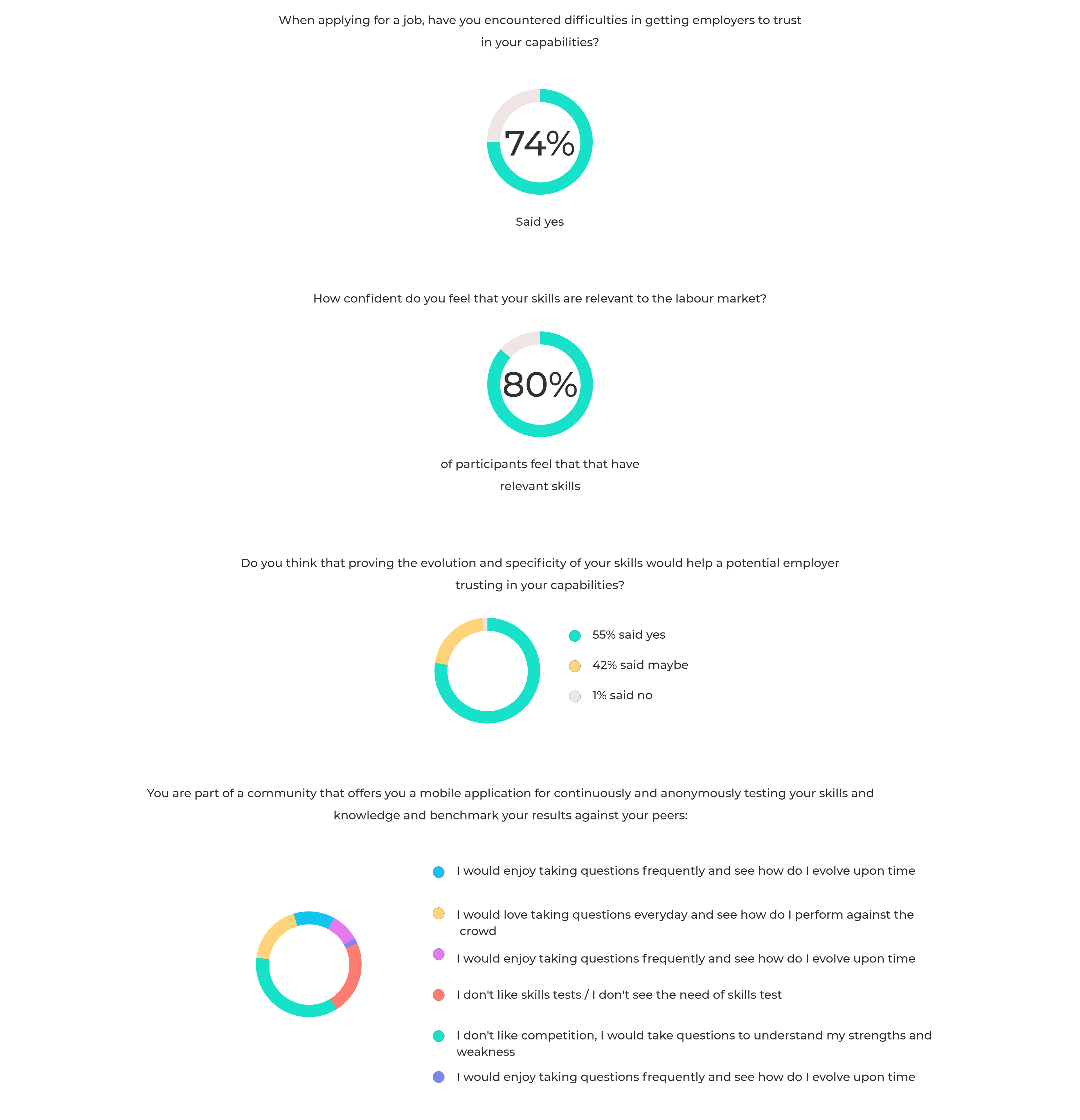
Survey
I first carried out a survey with some teammates to better understand our target audience and their pain points. The data gathered was answered by 100 participants who were either looking for employment or seeking a new role.
Here are the results:
User Flow Diagram
After discussing the findings with the team, the next step was to develop a user flow diagram.

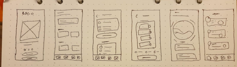
Low & Mid Fidelity
The next step was the start designing, I began drafting some ideas down on paper. Once I was happy with what I had down, I moved on to digitalising the design in mid-fidelity.
Style Guide
As TiiQu is based on blockchain and AI technology, I wanted to capture this through the UI of the app, here is how I went about achieving this:
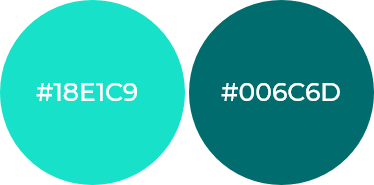
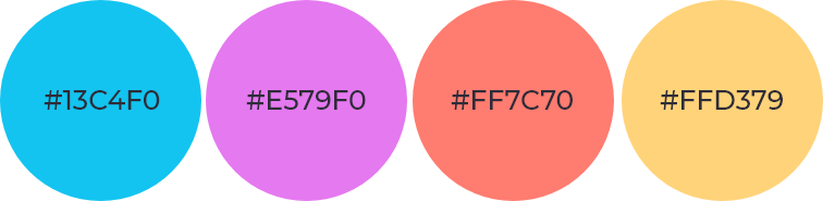
Colour Scheme:
Primary colours - Has a tech and futuristic feel to it. Eye-catching and engaging without being too distractive to users.
Secondary colours- Predefined colours that were a part of the brand identity. Has a playful and fun feel.
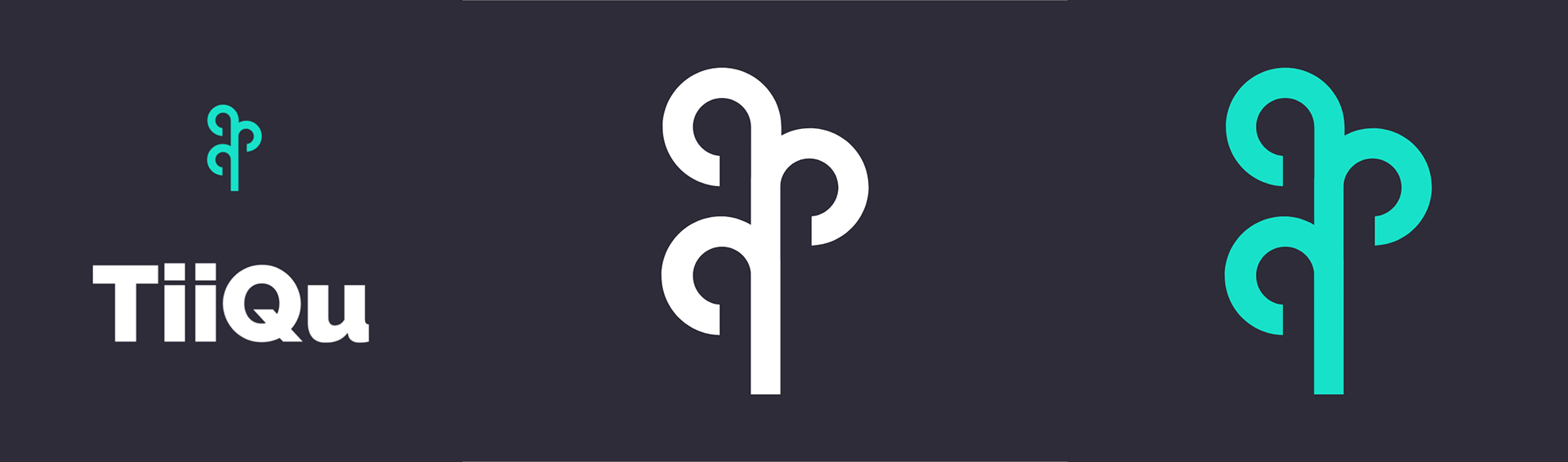
The Logo:
Represents the ‘tree of life' and the infinite possibility of growth through your TiiQu.
UI Elements:

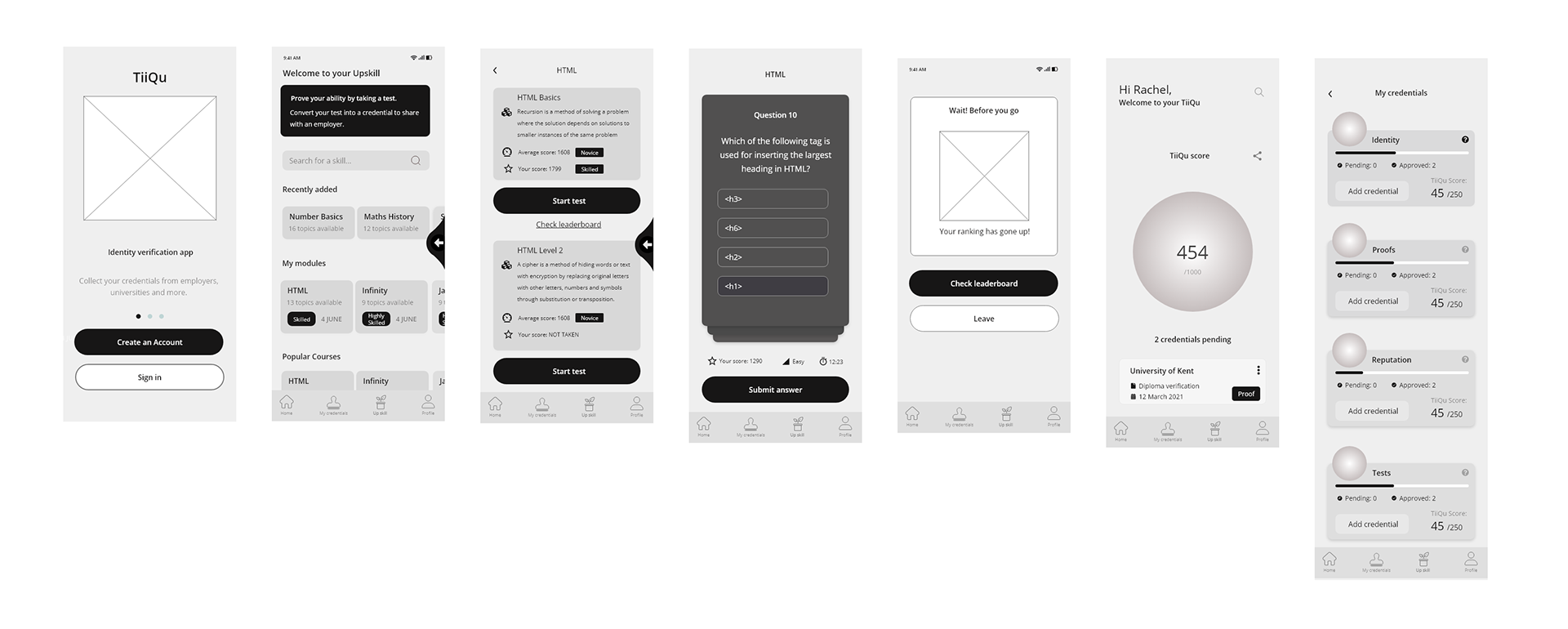
High Fidelity
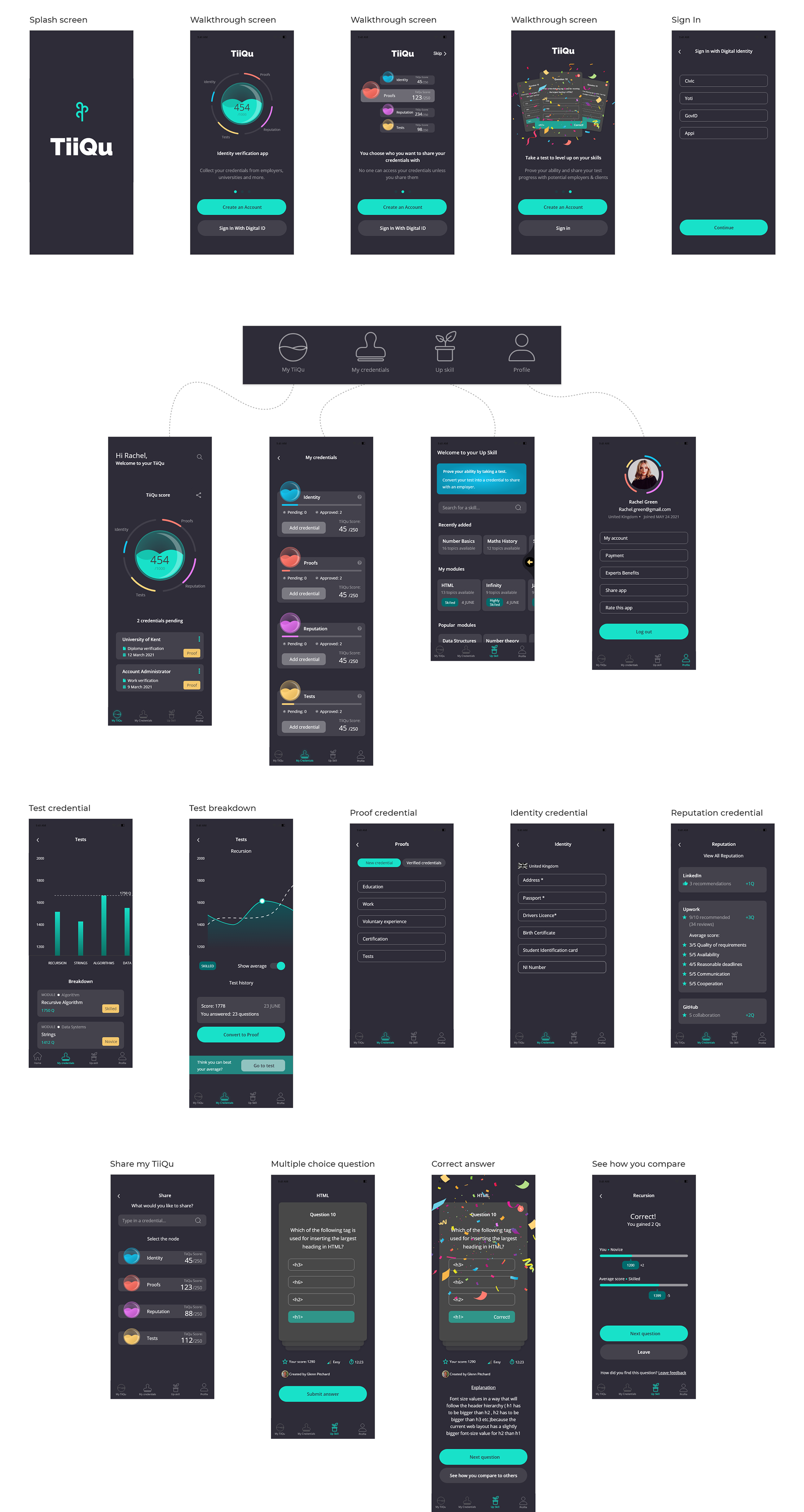
Dark Mode:
I designed in dark mode as there were a lot of colours a part of the brand's identity, against a white backdrop the colours seemed a little drowned out.
So I decided to design in dark mode as it has a sleek, modern, and elegant feel to it.
TiiQu Score
The TiiQu score is a core aspect of the app, Here's the redesigned version of the TiiQu score:
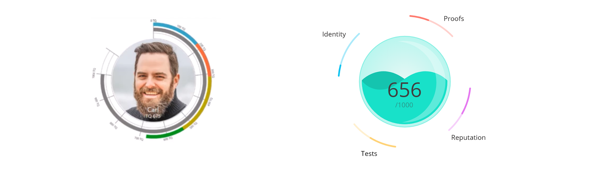
The client wanted a fun aspect to the TiiQu score, I proposed the idea of having the score animated when users first launch the app. Here's a short snippet of the animation:
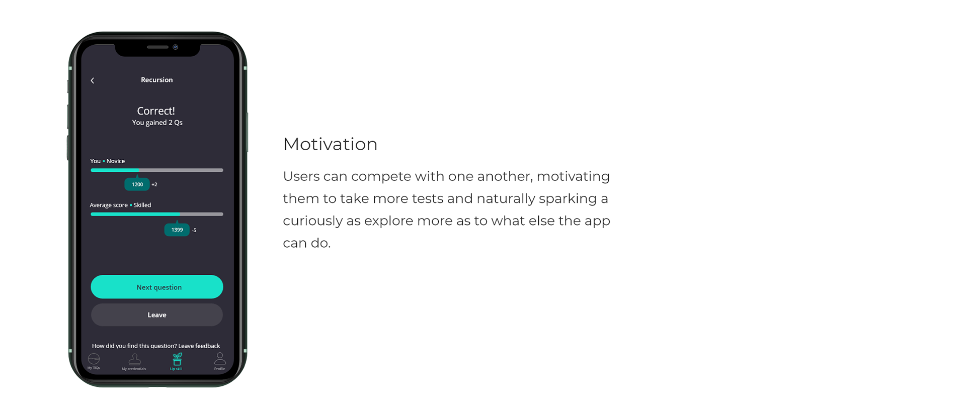
Gamification
One of the main challenges I faced was how to create an app that was fun, kept users engaged, and evoked trust. After doing some research and many trial and error, the solution I put forward was to including gamification features.


Walkthrough Video
Reflection
This has probably been one of the most complex apps that I had to design, going through the whole design process from start to finish brought its challenges but also a lot of joy. Through multiple rounds of iterations and trial-and-error on user flows, journey maps, and wireframes, I learned to be open to feedback and embrace changes to ultimately improve the product for users.
Thanks for Scrolling!