Sector: E- Learning
Time: 2 months
Tools: Figma
Role: UX/ UI design
About the Project
HCFC Phase-out project of harmful ozone-depleting substances from the market by 2030.
This is a part of a larger project to help combat climate change by promoting energy-efficient technology in Uzbekistan. One of which aims to certify engineers in installing refrigerators and aircon in a sustainable way.
The Challenge
The current website needs updating as it is not user-friendly and needs to be responsive on all devices.
Over 90% of engineers access the website through their mobile, nearly all users have said that they struggle to navigate through the site and read the course content.
Over 90% of engineers access the website through their mobile, nearly all users have said that they struggle to navigate through the site and read the course content.
Goal
In 2 months, the goal is to redesign the website, taking a mobile-first approach so that it is easier to complete the course.
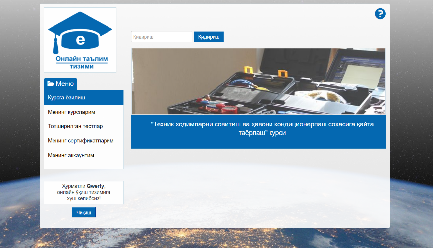
This is how the current website looks:
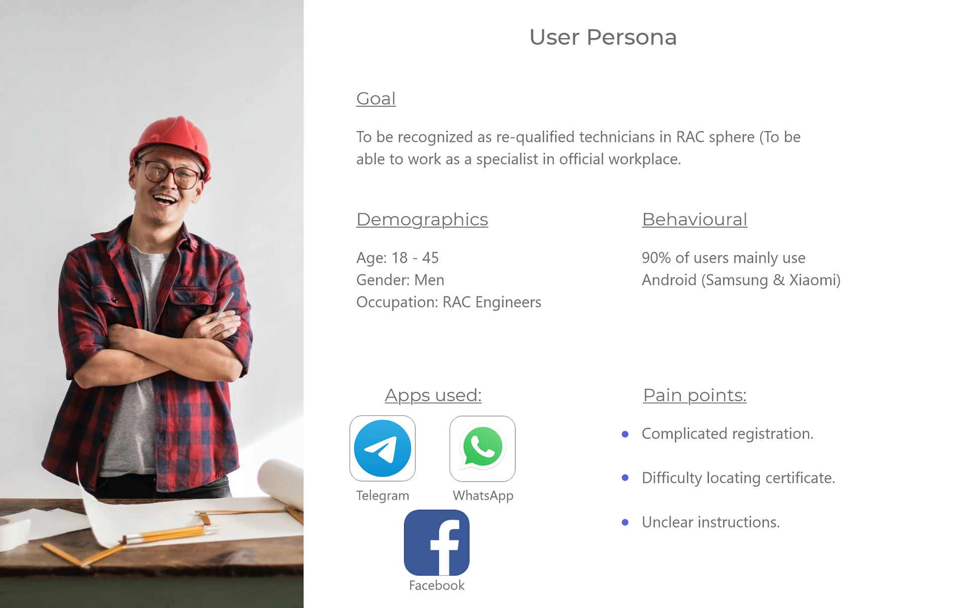
This particular client had a very specific target audience who use the site. Based on this, I created a user persona to help me empathise with the users and in turn, guide my design solutions.
User Flow Diagram
The website's original flow was very confusing so here I mapped out the key screens in order for the user to complete his task.
In this project, the main goal was so that the user can complete his course and download his certificate.

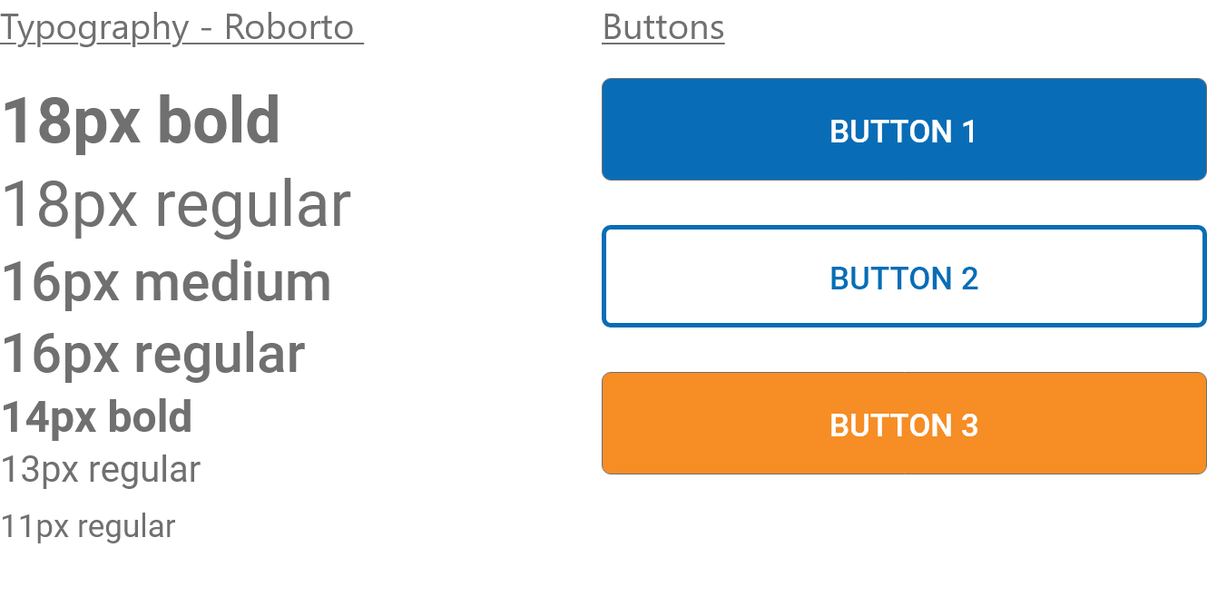
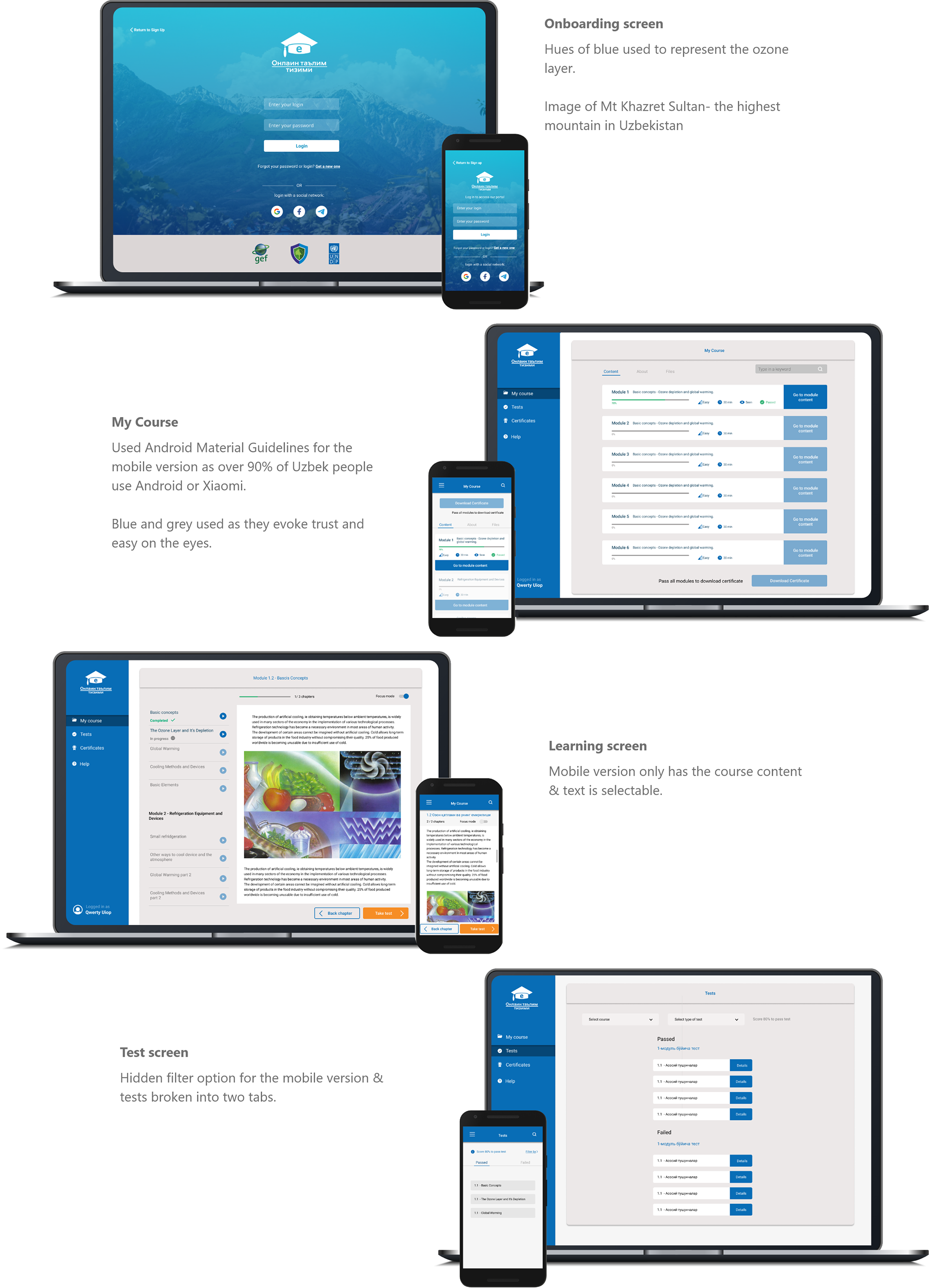
Style Guide
The client had asked me to create a new colour scheme that fits the needs of the users. So, I carried out research and came up with the following colour pallet and my rationale for choosing these colours.

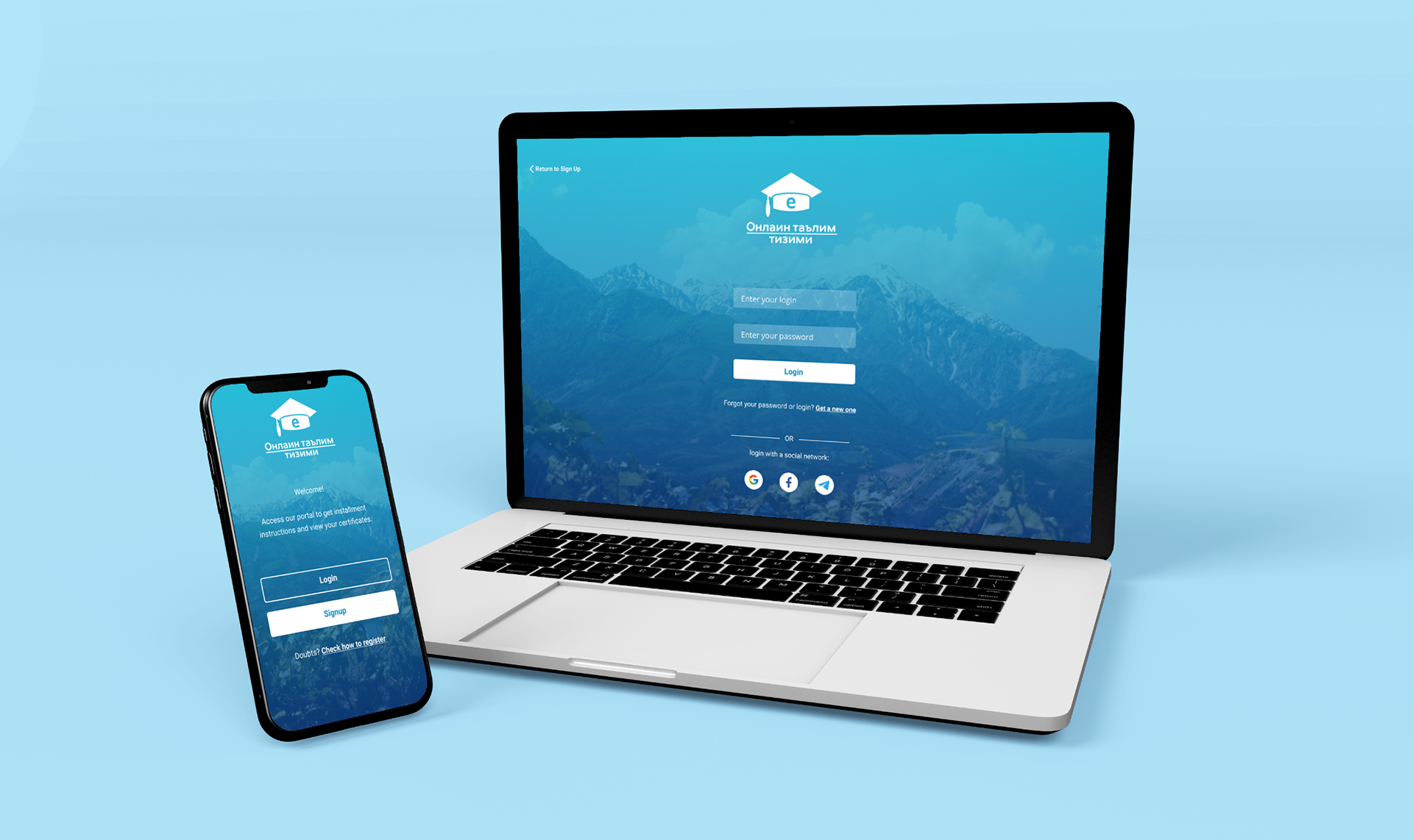
Design Solutions
Here are the key screens and the changes that were made to them in order to meet the user's needs.

Additional screen
Challenge
This is the first screen new users see. All users were confused about where to go from here, in order to enroll, they must click on this button otherwise they will not receive their certificate. Many users sent complaints as they had completed a course and had not received their qualification.
This is the first screen new users see. All users were confused about where to go from here, in order to enroll, they must click on this button otherwise they will not receive their certificate. Many users sent complaints as they had completed a course and had not received their qualification.
Solution
I designed the enrolment as a part of the onboarding process and sent an email confirmation once they had successfully enrolled. This way, users were ensured that they will definitely receive their qualification.
I designed the enrolment as a part of the onboarding process and sent an email confirmation once they had successfully enrolled. This way, users were ensured that they will definitely receive their qualification.
Mockups
Here are the final designs with their large and small breakpoints.
Demo video of the final product:
Retrospective
This project has been a valuable experience in many respects. As a designer, I want to work on projects that are impact-driven. More specifically, projects that aim to tackle climate change, and this happened to be just that. Here are some of the key takeaways from this project.
1. Understanding the target audience:
This project had a very specific target audience and being able to understand their pain points helped accelerate developing design solutions.
2. Empathising with the users:
As someone who likes to hone in on visual aesthetics, this project made me realise that functionality comes first and then the visuals. Although I wasn’t too keen on the final visuals, I can appreciate that it meets the needs of the audience.
Thanks for reading